
Free Baseline Grid Generator
Audit vertical rhythm instantly with our 100% free baseline grid generator. Upload any screenshot, set the line density and how often a strong rung falls, and misaligned type shows at once, then export SVG or 600 DPI in seconds. No signup, no downloads needed. Trusted by 60,000+ artists worldwide.
One horizontal per line of type
Evenly spaced horizontals at the leading of the body text, with every nth line emphasised. Type sitting on the same baselines across columns is what makes facing pages look set rather than assembled.
2 controls, not a fixed picture
Set line density and strong-line interval. Every one is live on the canvas.
Stacks with layout & design
Overlays combine, each carrying its own transform, so this one can sit under or over modular grid, modulor and column, and 11 more in the same set.
Rhythm you can measure
Export as PDF at true size and the line spacing measures its stated value. SVG for placing the baselines directly into a layout file.
| Ctrl + Z | Undo |
| Ctrl + Y | Redo |
| Esc | Deselect overlay |
| Alt + drag | Free positioning (no snap) |
| Ctrl + scroll | Zoom canvas |
| Ctrl + P | |
| ? | Show this help |
A stack of horizontal rungs laid over the page you actually made, so you can see which lines of type are sitting on the rhythm and which are floating half a line off it.
The baseline grid generator draws one of the 82 composition overlays in Grid Maker Pro, and the rest stack on the same image.
- 8–60 rungs
- Every 2nd–12th heavier
- SVG + 600 DPI export
- Nothing uploaded
What is a baseline grid?
The baseline grid generator is a free browser tool that lays a stack of equally spaced horizontal rungs over a layout, a screenshot or a blank canvas. You set how many rungs fall across the canvas's short side — anywhere from 8 to 60 — and how often a heavier rung marks the module, from every second rung to every twelfth. The overlay carries its own transform, so you drag and scale the stack until its rungs land on the baselines your document actually has. Export is vector SVG or raster to 600 DPI, and nothing leaves your device.

How to check a layout against a baseline grid
A baseline rhythm laid over a finished layout, with a strong line every few, so you can see which elements are sitting on the grid and which are merely close to it.
Bring in the layout you want to check
A baseline grid needs a page to sit on: drop in a screenshot, a page exported from your layout software, or a scan of a printed spread. Or start on the blank canvas at your paper size if you are building the rhythm before there is any type.
JPG · PNG · GIF · WEBP
Set the density and the strong rung
Raise or lower the rung count until the spacing is close to your leading, then set how often a heavier rung falls — every fourth is the usual choice, because a four-line module is what most editorial grids are built on.
Line density · Strong-line interval
Drag the stack onto the first baseline, then read it
A baseline grid is measured from the first baseline, not from the top edge, so drag the whole stack down until the first rung sits under the first line of body type. Anything floating between rungs is the thing to fix.
PNG · JPG · PDF · SVG · up to 600 DPI
Three steps, about a minute. No signup, no upload.
What the Baseline Grid Generator does
It works on the artefact, not the file
A baseline grid drawn here goes over anything, where your layout software shows its grid only inside its own document. A screenshot of a live site, a client's PDF, a printed page you scanned — none of those open in InDesign with the grid intact. This lays rungs over the thing itself.
The heavy rung is the module
Rungs alone are a ruler. Every fourth rung drawn heavier turns the ruler into a structure, so you can see whether a heading is one module tall or one module plus a stray line — which is the mistake that makes a spread feel unsettled.
Density across the short side
The rung count is measured across the canvas's short side, so the same setting gives the same spacing whether the page is portrait or landscape. At 28 on A4 the spacing is 7.5mm — which puts 39 rungs down a portrait page and 27 across a landscape one.
Aligned to type, not to the page edge
Text rests on a line rather than above it, so a baseline grid starts at the first baseline. The overlay has its own transform: drag it down until the rungs coincide with real type instead of with the top trim.
Readable over a busy page
Sixty hairlines over a dense spread is unreadable. Per-overlay colour and opacity, and an eyedropper that samples the page underneath, let the rungs sit at the weight where you can still see the type you are judging.
Out as vector or at print size
SVG export keeps the rungs as real hairlines, which matters for a grid whose whole job is being thin. Raster export is sized from the paper format and DPI you choose, up to 600.
Baseline grid examples: four ways the rungs read
Baseline grid vs a layout program's own baseline grid vs a browser devtools grid overlay
| Option | Works on a screenshot or proof | Strong rung marks the module | Vector export | Cost |
|---|---|---|---|---|
| Grid Maker Prothis tool | Yesover any image you load | Yesevery 2nd to 12th | SVG + raster to 600 DPI | Free |
| A layout program's own baseline grid | Only inside its own document | Usually a separate setting | Via the document | Subscription |
| A browser devtools grid overlay | Only on a live page you control | No | No | Free |
| A ruler on a printed proof | Yes | By counting | No | Time |
Who a baseline grid is for: work that has to hold a rhythm down a page
How a baseline grid works — The rung, the module, and why vertical rhythm is the hardest grid to hold
A baseline grid is the vertical half of a layout, and the hard half. Horizontal grids are easy to see and easy to keep; vertical ones are neither, which is why baseline grids are taught constantly and held rarely. Among the 82 composition overlays this is the one a reader never notices and every line of type obeys. Vertical ones are neither, which is why baseline grids are taught constantly and held rarely. Here is what the overlay actually draws, what a baseline grid is for, and the specific failures it catches.
A baseline is the invisible line letters sit on — the one a lowercase n rests on and the tail of a g hangs below. A baseline grid is a stack of those lines, spaced at the leading of the body text, running the full height of the page. Every line of body type is supposed to land on one. When they all do, columns beside each other line up rung for rung, a spread reads as one system, and the page acquires a cadence the eye registers without naming.
The overlay draws exactly that: equally spaced horizontal lines, nothing else. No columns, no margins, no verticals. Spacing comes from a density setting — how many rungs fall across the canvas's short side — which is why the same number gives the same physical spacing on a portrait page and a landscape one. On A4 at a density of 28, the rungs are 7.5mm apart: 39 of them down a portrait page, 27 across a landscape one.
A baseline grid is not a design decision. It is the thing that keeps every other decision from drifting.
The strong rung is doing the real work
A plain stack of rungs tells you whether a line of type is on the rhythm. It does not tell you how much vertical space anything occupies, and that is usually the question. So every Nth rung is drawn heavier — from every second to every twelfth, four by default.
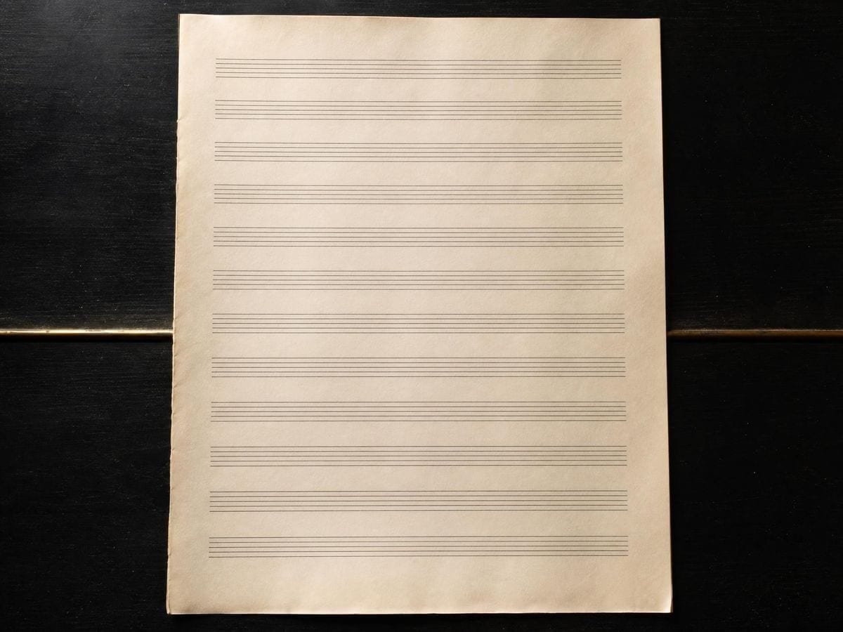
That heavier rung is the module. If your body is set 16 on 24 and you mark every fourth rung, the heavy lines are 96 units apart and every vertical measurement in the layout should be a whole number of them: a heading occupies one module, an image two, a pull quote one plus a rung. Reading the heavy lines is how you catch the classic fault — an element that is one module plus one stray line tall, which nothing on the page will ever line up with again.
Where the rhythm actually breaks
Headings are the usual culprit. A heading set larger than the body needs a line height that is a whole multiple of the baseline, or every line after it shifts. Set 32px type on 32px leading over a 24px baseline and the following paragraph starts eight pixels off the grid, and stays off for the rest of the column.
Images and rules are the second. An image whose height is not a whole number of baselines pushes the text beneath it out of step. The fix is not to resize the image to the pixel — it is to let the space beneath it absorb the difference, which you can only decide once you can see how far out it is.
Lists, captions and footnotes are the third, and the most forgiven. Set at a smaller size with tighter leading, they need a leading that divides the baseline — half a rung is fine, two-thirds is not. Two half-rung captions land you back on the grid; three leave you a third of a line out for the rest of the page.
Print and screen keep the same rule and different numbers
The baseline grid overlay page covers that history, beside the rest of the typography grid overlays. In print the baseline grid is measured in points and set once for a document, and the whole thing is enforced by the layout program: type is locked to the grid and it stays there. Josef Müller-Brockmann's Grid Systems in Graphic Design (1981) is where the discipline is set out most completely, and the Swiss work it came out of is the reason a mid-century annual report still looks composed.
On the web nothing enforces it. Line heights are inherited, margins collapse, images load at whatever height they load at, and a single component with an odd padding value knocks a column out of rhythm for the rest of the scroll. Which is precisely why an overlay on a screenshot is more useful for web work than for print: the print grid is in the file and can be trusted, while the web grid only exists if the rendered page happens to obey it.
How to use it as a checking instrument
This is the wrong place to start. Set the type first, decide the leading, build the layout with the column grid generator or the modular grid generator — then lay the rungs over the result. A baseline grid used as a design tool from the first minute produces layouts that are on the grid and dead; used as a check on something already composed, it finds the two or three places where the rhythm slipped.
Align before you judge. Drag the stack down until the first rung sits on the first line of body type, because a grid that starts at the top trim will report every line on the page as wrong by the same amount and tell you nothing. Once the first rung is right, everything below it is a real reading.
Then look for floaters. Scan down each column for a line of type sitting between two rungs rather than on one, and note where the drift starts — the element immediately above the first floater is what broke the rhythm. Fixing that one thing usually re-seats everything under it, which is why this is worth checking before you start nudging individual paragraphs.
Where a baseline grid gets used

I check the built page, not the design file. The comp was on the grid; the thing that shipped has a component with 18px of padding in it, and the only way I found that was laying rungs over a screenshot.
For a book I set the grid once and let InDesign hold it. Where this earns its place is checking the printed proof — the press sheet is the only artefact that tells you what actually happened.
Teaching it, the heavy rung is what makes it click. Students see a ruler and shrug; they see the module and immediately understand why their heading is the wrong height.
Baseline grid: frequently asked questions
The geometry
Can I type in my exact leading?
Not as a number. You set the density, then drag and scale the stack over your layout until the rungs coincide with the baselines the document actually has. For checking a layout that is the more reliable order anyway, because it measures the artefact rather than trusting the setting.
Why is every fourth line heavier?
That is the strong-rung interval, which runs from every second rung to every twelfth. It marks the module — the block of baselines that headings, images and pull quotes should each occupy a whole number of. Without it you have a ruler; with it you have a structure.
Should the grid start at the top of the page?
No. Type rests on a line rather than above it, so a baseline grid is measured from the first baseline. Drag the stack down until the first rung sits under the first line of body type — a grid aligned to the top trim reports every line as wrong by the same amount, which tells you nothing.
What do I do about headings that break the rhythm?
Give the heading a line height that is a whole multiple of the baseline, and put any extra space above it rather than inside it. A 32px heading on a 24px baseline wants 48px of leading, not 32 — otherwise everything after it runs eight pixels off the grid and stays there.
Does this work on a screenshot of a website?
That is the case it is best at. A layout program can only show its grid inside its own document, so a live page, a client PDF or a printed proof has no grid to show. Loading the image and laying rungs over it is the only way to check the artefact that actually exists.
Is a baseline grid the same as an 8-point grid?
No, though they get used together. A baseline grid is horizontal rungs at the text's leading and governs where type sits. An 8-point grid is a spacing step applied in both directions and governs sizes and gaps. A layout usually wants both, and they agree when the baseline is a multiple of the spacing step.
Using it
What does the density setting actually control?
How many rungs fall across the canvas's short side, from 8 to 60. Because it is measured on the short side, the same setting gives the same physical spacing whichever way the page is turned: at 28 on A4 the rungs are 7.5mm apart, which is 39 of them down a portrait page and 27 across a landscape one.
How do I pick a baseline value in the first place?
Start from the body text: its line height is the baseline. Sixteen-pixel type on twenty-four-pixel leading gives a 24px baseline, and every vertical measurement in the layout should then be a multiple of 24. Choose the body setting for readability first and let the grid follow it, never the other way round.
How do I line the rungs up with text that is already set?
Adjust the density until a run of rungs falls on a run of baselines, then drag the overlay vertically until they sit on the text rather than between it. If no density ever agrees over several lines, the text is not on a consistent leading, which is the finding.
What should I set the strong-line interval to?
To the number of lines in your smallest structural unit, commonly four. Every fourth rung is then heavy and you count in blocks rather than in rungs. It is a reading aid, not a constraint: nothing is measured from the heavy lines.
Export and print
Can I export it to use in another program?
Yes. SVG export keeps the rungs as true vector hairlines, which matters for a grid whose whole job is being thin. Raster export goes to 600 DPI and is sized from the paper format you picked rather than from your browser window.
Can I print a proof with the rungs on it?
Yes, at up to 600 DPI on your page size. A printed proof with the baseline grid over it is the traditional way to catch a heading that has knocked the following text off the rhythm, and it is easier to see on paper than on screen.
Choosing a grid
Should I use this or my layout program's baseline grid?
The layout program's, while you are setting the document: it snaps text to the grid, which this does not. This is for checking things the layout program never made: a screenshot, a PDF from a client, a live web page. The two do not overlap much.
Practical matters
Does my layout get uploaded anywhere?
No. Everything happens in your browser — the image is drawn to a canvas on your own device and never sent anywhere. There is no account and no upload step, which also means an unreleased client layout stays unreleased.
Can I check a website's vertical rhythm with it?
Yes, and it is one of the better uses. Screenshot a full page, load it here and find the density that agrees with the body text; then look at what the headings and images do to the rhythm. Nothing is uploaded, so a staging site behind a login is fine.
Is it usable for teaching typography?
Yes — laying a baseline grid over a well-set page and a badly-set one, side by side, makes the argument in about ten seconds. No account is needed, so a class can each try it on a page they chose themselves.
Open the tool Baseline grid generator
Rungs over the page you actually made
Set the density, mark the module, drag it onto the first baseline, and find the two lines that are floating. No signup, nothing uploaded.
Back to the generator →