Skip to content →

Field guide · Real artist applications

Real grid techniques, real use cases

Eight worked examples from the studio — portrait, landscape, architecture, figure, photography, pattern, comic panels, and product photography — each paired with the recommended overlay from the 82-overlay catalogue, the reasoning behind the pairing, and the pro tips that make it stick.

Looking for your discipline in depth? Try the audience hubs for artists, photographers, designers, and architects.

Plate 01 Drawing transfer Beginner friendly
Portrait reference photo in golden-hour light, before the grid overlay
The same portrait reference with an 8 by 8 square grid overlay

Drag the line — an 8×8 square grid over the reference.

Portrait drawing

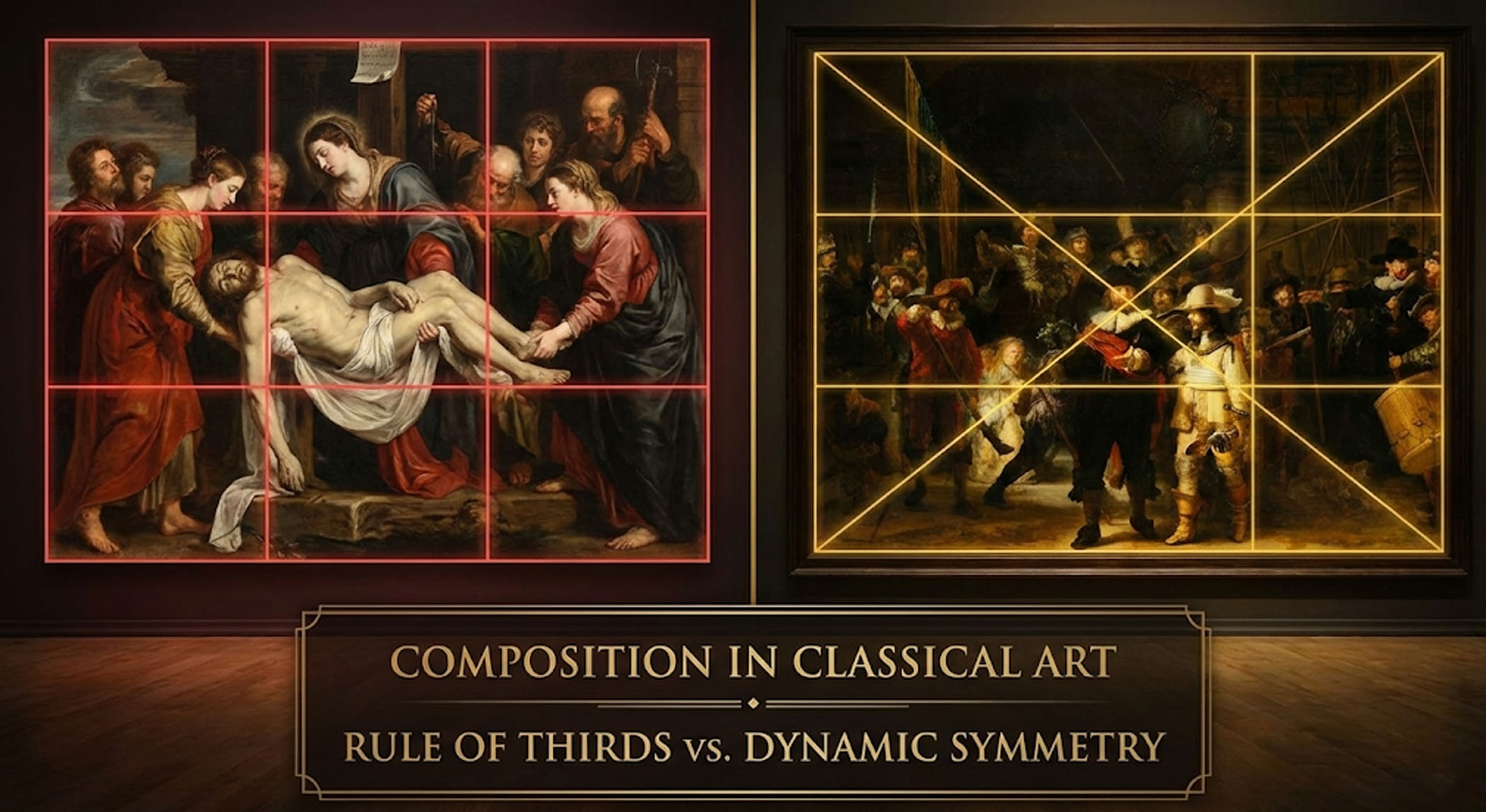
The grid method earns its keep fastest on faces, where a few millimetres of drift turn a likeness into a stranger. Squaring the reference breaks one intimidating problem — "draw this person" — into dozens of small, checkable ones.

  • Proportions you can verify. Eye spacing, nose length, and mouth placement become measured distances, not guesses.
  • Symmetry control. The centre vertical keeps both halves of the face honest across the axis.
  • Errors caught early. Drift shows up in square three, not at the end of the sitting.

Recommended overlay

Square grid, 8×8

The classical grid-method standard — enough reference points without clutter. Move to 12×12 for fine detail, or add the portrait face guide for feature landmarks.

Pro tips for portrait drawing
  • Start with a 4×4 grid for initial proportions, then add detail grids for complex areas
  • Align the central vertical line with the nose for symmetry
  • Use horizontal lines to mark eye level, nose bottom, and mouth centre
  • Pay special attention to the triangle formed by eyes and mouth
  • Don't trace slavishly — use the grid as a guide, not a crutch
Try this technique
Plate 02 Composition Intermediate
Tuscan countryside landscape reference in golden light, before the grid
The same landscape with a rule of thirds overlay marking the horizon line

Drag the line — the rule of thirds settles the horizon question.

Landscape painting

Most landscape problems are placement problems: where the horizon sits, where the focal tree or building lands, where the road leads the eye. The thirds armature answers all three before a brush is loaded.

  • Horizon discipline. Upper third for dramatic skies, lower third when the land carries the story — never the dead centre by accident.
  • Focal points on power points. The four intersections are where the eye lands first; put the payoff there.
  • Depth in zones. The three horizontal bands map cleanly to foreground, middle ground, and distance.

Recommended overlay

Rule of thirds

The standard composition armature. When the scene has a strong road or river, layer the diagonal method on top to check the leading line.

Pro tips for landscape painting
  • Place horizons on the upper third for dramatic skies, lower third for emphasis on land
  • Position focal points — trees, buildings — at grid intersections for natural eye flow
  • Use diagonal grid lines to guide rivers, roads, and leading lines
  • Map atmospheric perspective: darker, sharper foreground; lighter, softer background
  • Simplify complex foliage by treating each grid square as a value and colour block
Try this technique
Plate 03 Perspective Advanced
Architectural reference photo with strong leading lines, before the grid
The same architectural reference with a fine 12 by 12 grid for checking verticals

Drag the line — a fine grid makes every leaning vertical visible.

Architectural sketching

Buildings forgive nothing. A vertical two degrees off plumb or a window rhythm that drifts reads as wrong even to viewers who can't say why. The grid is the plumb line, the level, and the unit ruler in one pass.

  • Plumb verticals. Grid verticals expose any lean in columns, walls, and corners against the reference.
  • Counted rhythms. Windows and bays become countable units per square instead of estimated spacing.
  • Convergence under control. Roof lines and cornices crossing the grid reveal the perspective angle precisely.

Recommended overlay

2-point perspective

Street-corner views with two vanishing points are the urban-sketching default. For elevation studies and facade rhythm, the structural grid maps column bays directly.

Pro tips for architectural sketching
  • Use vertical grid lines to check plumb — they should match the building's verticals in the photo
  • Identify the horizon line first, then establish vanishing points beyond the frame
  • Map window patterns: count units horizontally and vertically within grid squares
  • For perspective shots, note where diagonal roof and cornice lines cross the grid
  • Sketch construction lines lightly, then commit to final linework with confidence
Try this technique
Plate 04 Anatomy Intermediate
Dancer in mid-movement, a figure drawing reference before the grid
The same dancer reference with a proportion grid for head-unit measurement

Drag the line — the grid pins down a pose that won't hold still.

Figure drawing

The figure is measured in heads — seven to eight crown-to-feet in the classical canon — and the fastest way to learn that canon is to see it ruled over real bodies in real poses, foreshortening included.

  • The head as the unit. Shoulder width, torso length, and limb reach all resolve to head-counts you can check.
  • Landmarks on lines. Chin, shoulders, navel, knees — the canon's horizontal landmarks sit on grid lines.
  • Foreshortening measured. Negative spaces inside grid squares keep compressed limbs honest.

Recommended overlay

Figure proportions — the 8-head canon

Purpose-built for full figures. For the head itself, switch to the Loomis head construction guide.

Pro tips for figure drawing
  • Use the head as your unit of measure — mark 7–8 heads from crown to feet
  • Horizontal lines belong at chin, shoulders, nipples, navel, crotch, knees, and ankles
  • The central vertical follows the spine's curve — note where the weight sits
  • For seated and dynamic poses, compare negative spaces within grid squares
  • Start with a gestural line of action first, then refine with grid measurements
Try this technique
Plate 05 Composition Beginner friendly
Photography composition reference comparing framing choices, before the grid
The same photograph with a rule of thirds overlay showing subject placement

Drag the line — overlay an existing photo to see why the crop works.

Photography composition

Photographers use the overlays in both directions: planning a crop before the shoot, and running a post-mortem on existing frames to learn why one image holds together and its near-identical neighbour doesn't.

  • Subjects on power points. Eyes at top-third intersections is the portrait default for a reason.
  • Crops you can defend. Reframe an existing photo against the armature instead of nudging by feel.
  • Movement on diagonals. The baroque diagonal puts energy into arms, roads, and gaze direction.

Recommended overlay

Rule of thirds, then baroque diagonal

Start with thirds; stack the baroque diagonal on top when a frame needs movement. Both overlays transform independently in the tool.

Pro tips for photography composition
  • Place subject eyes at top-third intersections for portraits
  • Align horizons on thirds — centre only when the symmetry is intentional
  • Use dynamic-symmetry diagonals to position arms, paths, or gaze direction
  • Leave breathing room in the direction the subject faces or moves
  • Overlay grids on existing photos to learn why compositions work or fail
Try this technique
Plate 06 Surface design Intermediate
Tulip field with natural repeating rows, a pattern design reference before the grid
The same repeating-pattern reference with a square tile grid overlay

Drag the line — the tile unit becomes visible inside the repeat.

Pattern design

Seamless repeats live or die at the tile boundary. Designing inside a ruled square — and testing the repeat against its neighbours — catches the misaligned motif before it reaches the printer.

  • Clean tile edges. Motifs that cross the boundary must re-enter on the opposite edge at the same coordinate.
  • Consistent spacing. Grid intersections anchor motif placement so density stays even across the repeat.
  • Offset repeats ruled. Half-drop and brick layouts are half-unit offsets you can read straight off the grid.

Recommended overlay

Custom grid

Set the division to your exact tile unit. For straightforward block repeats the square grid does the same job with one tap.

Pro tips for pattern design
  • Design one tile unit within a grid square, then repeat it to test seamless tiling
  • Use grid intersections as anchor points for motif placement
  • For half-drop repeats, offset every other row by half a grid unit
  • Maintain consistent visual weight by filling roughly equal amounts per square
  • Test patterns at 50%, 100%, and 200% scale to ensure versatility
Try this technique
Plate 07 Sequential art Intermediate
Basketball player at the top of a jump shot, an action reference before the panel grid
The same action reference divided by a comic panel grid for framing the beat

Drag the line — panel borders decide where the action beat lands.

Comic panel layout

A comic page is composition twice over: each panel framed like a single image, and the page itself paced like a sentence. The panel grid handles both at thumbnail stage, where changes cost minutes instead of evenings.

  • Pacing made visible. Even gutters read as steady time; a wide gutter or a big panel is a beat change you chose.
  • Reading flow checked. The Z-path across panels is testable before any drawing is committed.
  • Reference framed per panel. Drop an action reference under the grid and crop each panel from the same pose.

Recommended overlay

Comic panel grid

Classic tier layouts with ruled gutters. For animatics and shot planning, the storyboard frame grid is the same idea tuned for film ratios.

Pro tips for comic panel layout
  • Thumbnail the page with the panel grid before drawing anything — pacing problems are cheapest to fix there
  • Reserve the largest panel for the beat that carries the page
  • Keep gutters consistent; widen one only when you want the reader to pause
  • Let a figure break the panel border only at the moment of highest action
  • Rough in balloon placement with the grid so dialogue never covers the focal point
Try this technique
Plate 08 Commercial Beginner friendly
Wine and cheese product arrangement, before the alignment grid
The same product arrangement with a center cross overlay for axis alignment

Drag the line — the centre cross pins the hero object to the axis.

Product photography

Commercial work inverts the usual advice: products are usually centred, labels squared to the camera, and whole catalogues held to one framing system so the grid of thumbnails reads as a set.

  • Deliberate symmetry. The centre cross makes "almost centred" — the worst place to be — impossible to miss.
  • Level shelves. A table edge held parallel to a horizontal line is the difference between staged and sloppy.
  • Catalogue consistency. Recrop every product image against the same overlay and the whole family aligns.

Recommended overlay

Center cross

The axis check for symmetric subjects. For lifestyle shots with props, the golden ratio overlay places the hero off-centre without losing balance.

Pro tips for product photography
  • Shoot wider than the final crop, then use the centre cross to land the hero object precisely
  • For symmetric products, align the label axis to the vertical centre line
  • Balance props by quadrant — one visual anchor per quadrant, never all four filled
  • Keep the table edge parallel to a horizontal grid line to avoid a sloping shelf
  • Recrop catalogue images against one grid system so the product family aligns
Try this technique

Notes from the studio

Illustrative composites of how the tool gets used in practice — not quotes from named individuals.

Bookmarked on the studio computer. The deep-link reopens with the exact overlay configured — no clicking through menus mid-session.
Portrait painterIllustrative scenario
Free and browser-only is the right shape for this kind of tool. I keep three tabs open during any project — one per overlay I'm comparing.
Brand designerIllustrative scenario
Lower friction means I actually use it, not save it for special occasions. Every overlay one click away.
Concept artistIllustrative scenario

Questions from the studio

The ones that come up every time the grid method is taught. The longer answers live in the 82-overlay reference and the methodology page.

Which overlay should a complete beginner start with?

For drawing transfer, start with the square grid — the classical grid-method standard. An 8×8 division gives enough reference points without clutter. For composition work, start with the rule of thirds and graduate to the diagonal armatures once placing subjects on the third-lines feels automatic.

Is working over a grid considered tracing?

No. A grid is a measurement aid, not a stencil — the same device Dürer built in the 1400s and ateliers have taught ever since. The grid tells you where a landmark sits; every line, value, and edge decision is still drawn by hand. Most artists use it as training wheels for the eye: measure with the grid, check freehand, and rely on it less over time.

How many squares should my drawing grid have?

Match the grid to the job. A 4×4 grid suits gesture and big proportions; 8×8 is the workhorse for portraits and still life; 12×12 and finer suit architectural detail. If one area needs more reference points than the rest, use the custom grid and concentrate divisions only where the subject needs them.

Can I stack more than one overlay at once?

Yes. The tool lets you activate several overlays together and transform each one independently — a common pairing is rule of thirds for placement plus a baroque diagonal for movement. Each overlay keeps its own scale, rotation, and position controls.

Do my reference photos get uploaded anywhere?

No. Grid Maker Pro runs entirely in your browser — there is no server-side image processing and no backend to upload to. Reference images never leave your device, whether you are overlaying, drawing, or exporting at print resolution.

Free, browser-only, no signup

Open the tool

Whichever discipline you work in — drop a reference, pick an overlay from the 82-overlay library, and the workspace is ready in under thirty seconds.