
Free Layout Grid Generator
Test seventeen layout systems instantly with our 100% free layout grid generator. Upload a screenshot of your own design and build column, modular, baseline or 12-column grids with margins and gutters set in place, then export PNG, PDF or SVG in seconds. No signup, no downloads needed. Trusted by 60,000+ artists worldwide.
Columns crossed with rows
A modular grid: vertical columns and horizontal rows together, so the page divides into modules rather than strips. Content can span several modules in either direction, which is what makes a layout system out of a column count.
4 controls, not a fixed picture
Set columns, rows, margin and gutter. Every one is live on the canvas.
Stacks with layout & design
Overlays combine, each carrying its own transform, so this one can sit under or over baseline grid, modulor and column, and 11 more in the same set.
Guides for the artboard
Export as SVG to bring the guides into a design tool as paths, or as a transparent PNG at up to 600 DPI to sit under a comp.
| Ctrl + Z | Undo |
| Ctrl + Y | Redo |
| Esc | Deselect overlay |
| Alt + drag | Free positioning (no snap) |
| Ctrl + scroll | Zoom canvas |
| Ctrl + P | |
| ? | Show this help |
Column, modular, baseline and template grids drawn over your own screenshot or artwork rather than beside it, with margins, gutters and module counts adjustable while you look at the result. Seventeen systems, exported print-ready. All seventeen are drawn from the 82 composition overlays the app carries.
- 17 layout systems
- 10 platform safe areas
- PNG · PDF · SVG
- Nothing uploaded
What is a layout grid generator?
A layout grid generator draws the column, module and baseline structure of a page as an overlay, directly over the design you are checking. Grid Maker Pro carries seventeen of these systems — typographic, template and architectural — and lets you change the column count, margin and gutter while the artwork stays underneath, so the decision is made against the real thing rather than a blank rectangle.

How to build a layout grid
A layout grid over a real screenshot, so the column count, the margin and the gutter are judged against artwork rather than in the abstract, then handed on as a spec.
Open the layout grid you are working in, and drop the artwork under it
Open the tool with the modular grid already selected, and switch to column, baseline, 12-column or any of the other fourteen from the sidebar. Drag a screenshot, a page export or a piece of artwork onto the canvas: the file is read by your own browser and stays there, and no account is needed. The grid redraws at the image’s proportions, so the columns you are looking at are the columns the layout would actually have.
JPG · PNG · GIF · WEBP
Set the margin, gutter and module count against what you can see
Change the column count, the margin and the gutter while the artwork is underneath. A twelve-column grid that looked right in the abstract often turns out to want a wider gutter once real type sits in it.
Columns · Rows · Margin
Export it at the size the work needs
Export PNG or JPG for a review deck, SVG for a vector spec a developer can measure, or PDF at up to 600 DPI for print. A transparent grid-only PNG drops straight into Figma or Photoshop as its own layer.
PNG · JPG · PDF · SVG · up to 600 DPI
Three steps, about a minute. No signup, no upload.
What the Layout Grid Generator does
It sits on the artwork
A downloaded 12-column template is a picture of a decision someone else made at a width you are not working at. This one is drawn at your image's proportions, over your image.
Margins and gutters are live
Both are percentages of the frame, so they hold when the canvas changes. You can watch a gutter get too tight as the column count rises instead of finding out later.
The baseline grid has a strong-line interval
Every nth line is emphasised, which is how a baseline grid is actually used: type snaps to the fine lines, sections align to the strong ones.
Platform safe areas are real measurements
Ten formats, each with the bands its own interface covers — the caption strip, the action rail, the status bar. A composition that survives those bands survives the feed.
Stack the systems that disagree
Put a baseline grid under a modular grid and the row heights either land on the baseline or they do not. That is a question worth asking before the page is built, not after.
Export is a spec, not a screenshot
SVG keeps every line measurable, so a developer can read the column width off the file. PDF at 600 DPI is what a printer needs. Neither carries a watermark.
Layout grid generator examples: four of the seventeen, in use
Layout grid generator vs a downloaded grid template vs a design tool's built-in layout grid
| Option | Drawn over your artwork | Margins and gutters adjustable | Vector export | Cost |
|---|---|---|---|---|
| Grid Maker Prothis tool | Yesat your image's proportions | Yeslive, as percentages of the frame | SVG + raster to 600 DPI | Free, no account |
| A downloaded grid template | Noa fixed image at a fixed width | No | Depends on the file | Free to paid |
| A design tool's built-in layout grid | Yesinside that tool only | Yes | Within the tool | Subscription |
| Drawing guides by hand | Yes | By re-drawing them | Yes | Free, and slow |
Who a layout grid generator is for: the people who have to make the layout hold
How a layout grid generator works — Why a grid drawn beside the work is worth less than one drawn on it
Layout grids get chosen in the abstract — twelve columns because twelve divides well, a 4px baseline because the type is 16px — and then the artwork is fitted to the decision. This page is the entry point to seventeen of the 82 composition overlays, the ones that organise a page rather than a picture. Doing it the other way round is quicker and produces better pages, and it only needs the grid to be somewhere you can see the work through it.
The column grid
The column grid is the oldest of these and the simplest to state: divide the usable width into equal columns separated by gutters, and let every element span a whole number of them. What the statement leaves out is that the number of columns is a compromise between how many distinct widths you want and how narrow you are willing to let a single column get. Twelve is popular because it divides by two, three, four and six, which covers most of the layouts anyone actually draws. It is not a law, and on a narrow page it produces columns too thin to hold a word.
The modular grid
The modular grid crosses that column structure with rows, producing a field of modules. Josef Müller-Brockmann's Grid Systems in Graphic Design (1981) is the book that fixed the method in the profession, and its argument is not really about geometry: a grid is a way of making a series of pages feel like one publication, by removing the need to re-decide the same things on every spread. The cost is that a module is a commitment. A photograph that wants to be slightly wider than three modules is a photograph you will crop.
The baseline grid
The baseline grid is the one most often skipped and most often missed. Every line of type in a column sits on a baseline, and if two adjacent columns use different leading, their lines drift apart down the page. A baseline grid fixes a single vertical rhythm that all the type snaps to. The strong-line interval matters here: with a 4px baseline you do not align sections to every fourth pixel, you align them to every fourth or eighth line, and the overlay draws those emphatically so the two scales stay distinguishable.
The 8pt spacing grid
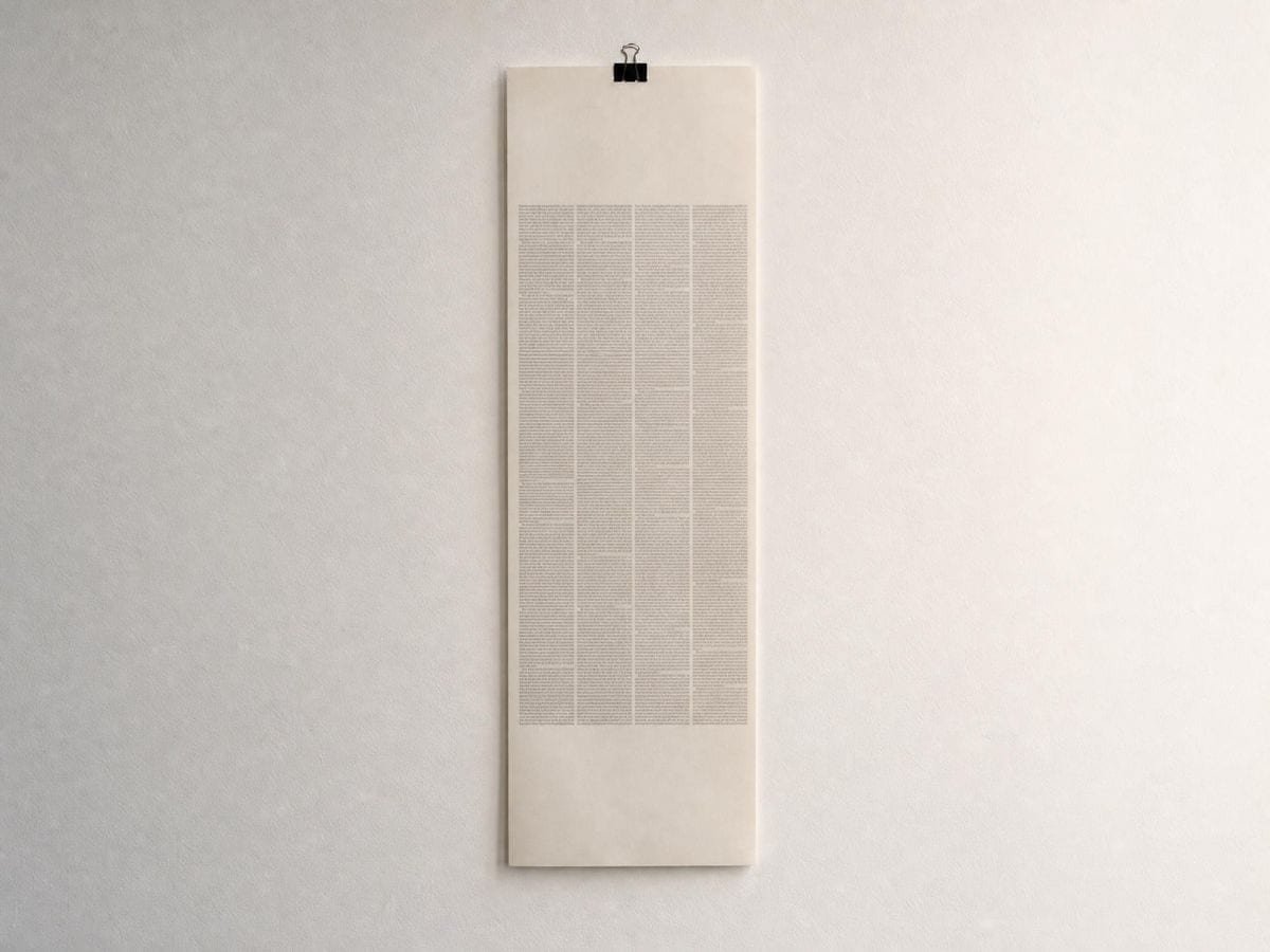
The 8pt spacing grid belongs to none of those traditions and has become the most widely used of all of them. It is not a grid of cells but a rule about distance: every gap, padding and offset is a multiple of eight. Its appeal is arithmetic rather than aesthetic — eight divides cleanly at the density ratios interfaces are rendered at, so a value survives being scaled without landing on a half pixel. Where a modular grid answers where an element goes, the spacing grid answers how far it sits from the next one, which is why the two are usually running at the same time and why stacking them is worth doing before either is committed to code.
The manuscript grid
The manuscript grid — one text block with margins — predates all of them and still governs books. Its proportions were the subject of serious study long before the profession existed; Jan Tschichold reconstructed a medieval canon in which the text block's diagonal runs parallel to the page's, which produces margins in a 2:3:4:6 ratio and a text area that is a smaller version of the page shape. That is a genuinely different way of arriving at a margin from picking a round number.
The template grids
The template grids are a different kind of object. A comic page, a storyboard, an icon keyline and a social safe area are not proportional systems; they are constraints imposed from outside — by a printer's trim, by a camera's aspect ratio, by a phone's interface. They belong in the same tool because the work is the same work: you are checking whether the thing you drew survives contact with the frame it will be seen in.
The safe-area grids are the clearest case of that. A vertical video is not shown at 9:16 — it is shown at 9:16 with a caption over the bottom fifth, a handle and a follow button above that, and a status bar across the top. Composing to the full frame and discovering afterwards that the subject is behind the caption is such a common failure that every platform publishes a safe-area guide, and the guides disagree with each other. Drawing the obstruction bands rather than just the safe rectangle is the difference between knowing something is covered and knowing what covers it.
The architectural systems
The three architectural systems are here because they are the same reasoning at a different scale. A structural grid places column bays; a tartan grid alternates wide and narrow bands so that servant space — corridors, risers, ducts — is designed rather than left over; Le Corbusier's Modulor derives a proportional series from human dimensions and the golden section. An architect and an editorial designer are both dividing a plane so that the divisions carry meaning, and the Modulor's series is the same phi progression a designer meets in the golden ratio.
None of this argues for a particular grid. It argues that the choice is empirical and cheap to test, and that the only reason it usually is not tested is that the grid and the work are normally in different windows. Put them in one and the questions answer themselves: whether the gutter is too tight, whether the modules fit the images you actually have, whether the caption is going to cover the face.
Where a layout grid generator gets used

A twelve-column grid that reads beautifully at desktop width can leave columns narrower than a long German compound word at tablet width. Checking it over a real localised screenshot is a five-second test that a template file cannot do at all.
The typography grid overlays set these systems out, and the design template overlays hold the page-shaped ones. The baseline grid argument only lands when someone can see two columns drifting apart. Drawing it over the actual spread ends the discussion in about ten seconds.
Safe areas are the thing juniors learn last and painfully. Having the obstruction bands drawn over the actual frame moves it from a rule they have been told to a thing they can see.
Layout grid generator: frequently asked questions
The geometry
What is a layout grid?
A layout grid is a set of invisible divisions — columns, rows, margins and baselines — that everything on a page aligns to. Its job is to remove repeated decisions: once the structure exists, an element's position is chosen from a small set of valid options rather than from anywhere on the page, which is what makes a series of pages read as one publication.
What is a baseline grid for?
A baseline grid fixes one vertical rhythm that every line of type sits on, so text in adjacent columns stays aligned down the page. Without it, two columns with different leading drift apart, and the mismatch becomes obvious in the lower third of a spread.
Can I put the grid over a screenshot of my own design?
Yes, and that is what the tool is for. Drop a screenshot onto the canvas and the grid redraws at that image's proportions, so the columns you see are the columns the layout would have. The file is read by your browser and never sent anywhere.
Does it include social media safe areas?
Yes, for ten formats: Instagram feed at 1:1 and 4:5, Reels and Stories, TikTok, YouTube Shorts, YouTube 16:9, X, LinkedIn, Facebook and Pinterest. Each carries its own safe rectangle, and the obstruction bands that platform's interface covers can be drawn on top.
Is the Modulor a layout grid?
The Modulor is a proportional series rather than a grid of cells, but it is used for the same purpose — deciding where divisions fall so that the result is consistent. Le Corbusier derived it from human dimensions and the golden section, and it is included here with the structural and tartan grids because architects divide a plane for the same reasons designers do.
Using it
How many columns should a layout grid have?
Twelve is the common default because it divides evenly by two, three, four and six, so it supports halves, thirds, quarters and sixths without fractional columns. It is a convenience, not a rule. Narrow pages often work better at six or eight, because twelve columns across a small width leaves each one too thin to hold a line of text.
Which of the four controls should I set first?
The margin. Columns and gutters are decisions about the text block, and the text block's size is decided by the margin — set it the other way round and you spend the rest of the session adjusting columns to compensate for a margin you never chose.
How do I check my own design rather than start a new one?
Load a screenshot and work backwards: raise the column count until the column edges agree with the design's own edges. Where they never agree, the design is not on a grid, and where they agree for three columns and not the fourth, you have found the element that drifted.
Export and print
Can I export the grid as SVG?
Yes. SVG keeps every line as measurable vector geometry, so a developer can read a column width straight off the file. PNG, JPG and PDF export up to 600 DPI, and a transparent grid-only PNG drops into Figma or Photoshop as its own layer.
Can I hand the grid to a developer?
Read the column and gutter percentages straight off, or export SVG. The percentages are the more use of the two, since a developer needs numbers for a stylesheet rather than a drawing. Export the composite if the point is which element is off.
Choosing a grid
What is the difference between a column grid and a modular grid?
A column grid divides the width only; a modular grid divides the width and the height, producing a field of rectangular modules. The modular grid gives stronger vertical control, which matters for catalogues and dashboards where elements must align across rows as well as down columns.
When do I need a modular grid instead of columns?
As soon as vertical position matters as much as horizontal — a catalogue with fixed card heights, a dashboard, a poster series. The modular grid generator adds rows and gives you modules; for running text, rows are structure you will never align to.
Practical matters
Do my images get uploaded to a server?
No. Grid Maker Pro has no server to upload to — the grid is drawn in this page and any screenshot you open stays on your machine. Unreleased layouts and client comps are exactly the material designers cannot risk uploading, and there is no endpoint here that would accept one.
Is this free?
Yes, with no account, no usage limit and no watermark on any export. The core tool is free permanently; the paid product is a separate augmented-reality tracing app for drawing on paper.
Does it cover social media safe areas?
Not as a preset. This draws columns, rows, margins and gutters; safe areas are platform-specific crops that change without notice, and a stale safe-area template is worse than none. Set the margin to the inset you need and use it as one.
Can I use it on client work under NDA?
Yes — there is no server to send anything to, so a confidential comp never leaves your machine. That is a structural property of how the tool is built rather than a policy, which is the version worth putting in front of a legal team.
Open the tool Layout grid generator
Seventeen systems, one canvas
Column, modular, baseline, template and architectural grids, drawn over your own artwork and exported print-ready — the column grid generator and the baseline grid generator take one system each. No signup, nothing uploaded.
Back to the generator →