
Free 12 Column Grid Generator
Lay out on the 12 column grid instantly with our 100% free generator, the system behind Bootstrap and most of the web. Upload a screenshot of your own design, set columns, gutter and margin, then export SVG or 600 DPI in seconds. No signup, no downloads needed. Trusted by 60,000+ artists worldwide.
Twelve columns, and their gutters
The web convention: twelve columns because twelve divides by two, three, four and six, so the same grid supports halves, thirds, quarters and sixths without a second system.
4 controls, not a fixed picture
Set columns, margin and gutter, toggle container border. Every one is live on the canvas.
Stacks with layout & design
Overlays combine, each carrying its own transform, so this one can sit under or over modular grid, baseline grid and modulor, and 11 more in the same set.
Guides for the browser and the comp
Export as SVG to place the columns into a design file, or as a transparent PNG to overlay a screenshot and check an implementation against the intent.
| Ctrl + Z | Undo |
| Ctrl + Y | Redo |
| Esc | Deselect overlay |
| Alt + drag | Free positioning (no snap) |
| Ctrl + scroll | Zoom canvas |
| Ctrl + P | |
| ? | Show this help |
Twelve is not a design preference. It is the smallest useful number that divides by two, three, four and six, which is why one grid can carry halves, thirds, quarters and sixths without a second system.
The 12 column grid draws one of the 82 composition overlays in Grid Maker Pro, and the rest stack on the same image.
- Divides by 2, 3, 4, 6
- Gutter set separately
- SVG + 600 DPI
- Nothing uploaded
What is a 12-column grid?
A 12 column grid divides a layout into twelve equal columns separated by gutters, inside an outer margin. Twelve is used because it is the smallest count with four useful divisors — two, three, four and six — so halves, thirds, quarters and sixths all land on column boundaries in the same system. This tool draws it over your own design at any column count, gutter and margin, and exports to PNG, JPG, PDF or SVG.

How to use a 12 column layout grid
Twelve columns, a margin and a gutter — the structure most of the web is laid out on, over your own artwork rather than over a blank frame.
Set the margin first, then the columns
The outer margin defines the live area; the columns divide what is left. Setting columns first and margin second means every margin change silently resizes every column, which is the usual reason a grid stops matching a design halfway through.
JPG · PNG · GIF · WEBP
Set the gutter independently
The gutter is not a fraction of the column — it is a fixed measure that stays constant while columns stretch. That distinction is what makes a grid responsive: at a narrow width the columns compress and the gutter does not.
Columns · Margin · Gutter
Lay elements to whole spans
An element spanning four columns is a third of the layout, three is a quarter, six is a half. Elements that stop between columns are what make a gridded layout look ungridded, and they are visible even to someone who cannot see the grid.
PNG · JPG · PDF · SVG · up to 600 DPI
Three steps, about a minute. No signup, no upload.
What the 12 Column Grid does
Four divisors, one grid
Twelve splits into halves (6+6), thirds (4+4+4), quarters (3+3+3+3) and sixths (2×6). Ten gives halves and fifths; sixteen gives halves and quarters but no clean thirds. Twelve is the smallest count that covers the four proportions layouts actually use.
Asymmetry without a second system
Eight columns beside four is a two-thirds/one-third split; nine beside three is three-quarters/one-quarter. Both come out of the same twelve without introducing a second grid, which is what makes editorial layouts possible on it.
The gutter is fixed, the column is not
Columns are a proportion of the available width; gutters are an absolute measure. Keeping them separate is what lets the same grid work at 320px and at 1440px without the spacing collapsing or ballooning.
Margin is a separate decision
The outer margin frames the whole layout and has nothing to do with the gutter between columns. Tying them together — a common shortcut — means you cannot widen the frame without also loosening the internal spacing.
Over your own design
The grid draws over a screenshot or a mockup you drop in, so you can check whether the layout you already have sits on twelve columns rather than guessing from a blank field.
Vector out
SVG keeps the column boundaries exact at any size, which matters when the grid is going into a design file rather than being looked at once.
12-column grid examples: four ways twelve divides
12-column grid vs 10 columns vs 12 columns
| Option | Halves | Thirds | Quarters | Practical problem |
|---|---|---|---|---|
| 8 columns | Yes | No | Yes | No clean thirds, which are the commonest layout |
| 10 columns | Yes | No | No | Gives fifths, which layouts rarely want |
| 12 columns | Yes | Yes | Yes | Nonethe practical minimum |
| 24 columns | Yes | Yes | Yes | A single column is too narrow to be a unit |
Who a 12-column grid is for: people laying out pages
How a 12-column grid works — Why twelve, where it came from, and what the gutter is really doing
The twelve column grid is so standard that its reasons have mostly been forgotten. Of the 82 composition overlays it is the one most people use without choosing. They are worth knowing, because they explain both why it works and the two places where it stops working.
The divisor argument
Twelve has divisors 1, 2, 3, 4, 6 and 12. In layout terms that means a twelve column grid natively expresses a half, a third, a quarter and a sixth of the available width, and every one of those divisions lands exactly on a column boundary.
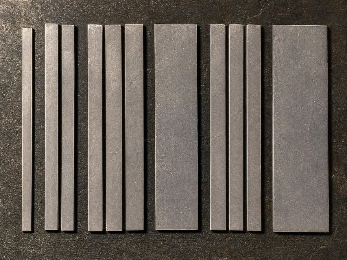
No smaller number does as well. Ten gives halves and fifths, and fifths are rare in layout. Eight gives halves, quarters and eighths but no thirds, and thirds are extremely common — three cards in a row is the single most-used layout on the web. Sixteen gives everything eight gives and still no thirds.
Twenty-four does better still, and some systems use it, at the cost of columns so narrow that a single column is no longer a usable unit. Twelve is the practical minimum that covers the common cases, which is the whole of the argument.
Where it came from
The convention reached the web through CSS frameworks. The 960 Grid System, released in 2008, offered 12 and 16 column variants on a 960 pixel container — 960 being chosen because it divides cleanly and fitted the 1024 pixel screens of the time with room for browser chrome.
Bootstrap adopted a twelve column grid and, through sheer ubiquity, made it the default assumption. Foundation used twelve. Later systems built on CSS Grid and Flexbox kept it, even though the underlying technology no longer requires a fixed column count at all.
The print tradition is older and less rigid. Josef Müller-Brockmann's Grid Systems in Graphic Design (1981) works through grids of two, three, four, five, six and eight fields, chosen per project rather than standardised — a reminder that twelve is a web convention rather than a law of layout.
What a gutter is, and the mistake
A gutter is the space between columns. The common error is treating it as part of the column — dividing the width by twelve and putting the gap inside each slice — which makes the gutter grow and shrink with the viewport.
Correct behaviour is the opposite. The gutter is an absolute measure that stays constant while columns absorb the change. At 1440 pixels wide with a 24 pixel gutter, the columns are wide and the gaps are 24 pixels; at 768 pixels the columns are narrow and the gaps are still 24 pixels.
This is why the tool sets gutter and column independently. A grid where the gutter is a percentage looks correct at the width it was designed at and wrong everywhere else, and the failure is subtle enough that it usually ships.
Margins are not gutters
The outer margin is the space between the layout and the edge of the viewport. It does a different job from the gutter: the gutter separates elements from each other, the margin separates the whole composition from the world.
They are frequently set to the same value out of habit, and there is no reason they should be. A wide margin with tight gutters reads as a dense block of content held away from the edges; equal values read as an even field. Both are legitimate; conflating them removes the choice.
Column spans, and the thing that looks wrong
The discipline of a column grid is that elements span whole numbers of columns. Four columns is a third, three is a quarter, six is a half, eight is two thirds.
An element that stops between column boundaries breaks the system, and it is visible even to a viewer who has never heard of a layout grid — what they see is that the edges of things do not line up down the page. Alignment down the page is most of what a grid buys.
The exception worth knowing is that images and full-bleed elements often deliberately break out of the grid. That works precisely because everything else obeys it: a deliberate exception reads as emphasis, while general inconsistency reads as carelessness.
Where twelve columns stop working
On narrow screens, twelve columns of a 375 pixel viewport are about 24 pixels each before gutters, which is narrower than a word. Almost every responsive system collapses to four or six columns below a breakpoint, and elements re-span accordingly — three cards across becomes one card stacked.
The other limit is editorial layout with genuinely irregular proportions. The column layout generator takes any count from 2 to 16, and the modular grid tool adds rows. A magazine page built on a five column asymmetric grid cannot be expressed in twelve, and forcing it produces columns that are nearly right and never quite. That is what the manuscript and modular grids are for.
The container width, and why 960 stopped mattering
The 960 Grid System fixed the container at 960 pixels because screens were 1024 wide and the arithmetic divided cleanly. That constraint disappeared with responsive design: containers now have a maximum width and shrink below it, so the column width is derived rather than declared.
What replaced the fixed container is a maximum measure. A text column wider than roughly 75 characters becomes hard to read regardless of how much screen is available, so most systems cap the container somewhere between 1140 and 1440 pixels and let the margins absorb everything beyond it. The twelve columns then divide whatever the container currently is.
This is why setting the margin before the columns matters in practice as well as in principle. On a capped container the margin is doing two jobs at once — framing the layout and absorbing the excess width — and changing it changes every column behind it.
The relationship to CSS Grid
CSS Grid made the twelve column convention technically unnecessary: it defines whatever tracks a layout needs, including named areas and asymmetric spans, without a column framework at all.
It persists anyway, for a human reason rather than a technical one. Twelve columns is a shared vocabulary: a designer can hand a developer "eight and four" and be understood without a specification. Systems survive on communication as much as on capability. The 12-column web overlay page covers why the number stuck, beside the rest of the page template overlays.
Where a 12-column grid gets used

Web and product design, which is where the convention comes from and where the twelve column vocabulary is understood without explanation.
Design review, checking whether an existing page actually sits on its grid — which is what drawing the grid over a screenshot answers in seconds.
Teaching layout, where the divisor argument makes the choice of twelve concrete rather than arbitrary.
12-column grid: frequently asked questions
The geometry
What is a 12 column grid?
A 12 column grid divides a layout into twelve equal columns separated by gutters, inside an outer margin. Elements span whole numbers of columns, so a four-column element is a third of the layout and a six-column element is a half.
Why twelve rather than ten or sixteen?
Because twelve divides by two, three, four and six. That covers halves, thirds, quarters and sixths in one system. Ten gives fifths, which layouts rarely want; sixteen gives quarters but no clean thirds, and three across is the commonest arrangement on the web.
Should the gutter be a percentage or a fixed size?
Fixed. Columns are a proportion of the available width and absorb the change as the viewport resizes; the gutter stays constant. A percentage gutter looks correct at the width it was designed at and wrong at every other width.
What gutter width should I use?
Commonly 16 to 32 pixels on the web, with 24 a frequent default. The value that matters is its relationship to your type size and vertical spacing, not an absolute: where the gutter is narrower than the paragraph spacing, two columns of running text read as one block.
Where did the twelve column convention come from?
It reached the web through CSS frameworks. The 960 Grid System in 2008 offered 12 and 16 column variants, and Bootstrap's adoption of twelve made it the default assumption. Print grids were never standardised this way — Müller-Brockmann works through two to eight fields chosen per project.
Do I still need it with CSS Grid?
Technically no — CSS Grid defines whatever tracks a layout needs. It persists because twelve columns is a shared vocabulary: a designer can say "eight and four" and a developer knows exactly what is meant, without a specification.
Can elements break out of the grid?
Deliberately, yes — a full-bleed image is the standard case. It works because everything else obeys the grid — a single intentional exception reads as emphasis, while general inconsistency reads as carelessness.
When is twelve columns the wrong grid?
When the layout is genuinely irregular. A magazine page built on an asymmetric five column field cannot be expressed in twelve, and forcing it gives columns that are nearly right and never quite. The manuscript and modular grids exist for those cases.
Using it
How do I check a live site against it?
Screenshot the page at the width you care about, load it here and set the margin and gutter until the column edges agree with the site's own. Twelve columns will agree with almost anything at some setting, so the informative case is when a specific element misses by a few pixels.
Should the container border be on?
While you are checking maximum width, yes — most of the twelve-column failures on real sites are about where the container stops rather than about the columns inside it. Once that is settled, the border is one more rectangle.
Export and print
Can I export the grid for a spec document?
SVG for a document, and the numbers for the developer. Twelve columns, your gutter and your margin are three values that go straight into a stylesheet; a picture of them is for the humans reading the spec, not for the person implementing it.
Does it print usefully for a design review?
At 300 DPI on A3, yes, though a twelve-column grid is really a screen artefact — the widths you care about are viewport widths, and paper has only one. Print it when the review is about hierarchy, screenshot it when the review is about breakpoints.
Choosing a grid
What is the difference between a gutter and a margin?
The gutter is the space between columns; the margin is the space between the whole layout and the edge of the viewport. They do different jobs and are frequently set to the same value out of habit rather than intention.
Do I still need twelve columns with CSS Grid?
Less than you used to. CSS Grid can give you whatever tracks the content wants, so the old reason for twelve — a framework's fixed classes — has gone. What survives is the human one: twelve divides by two, three, four and six, so a team can agree on halves, thirds and quarters without negotiating each time.
Practical matters
Is it free, and do I need an account?
It is free and there is no account. Nothing is watermarked.
Is my design uploaded?
No. Any image you drop in is decoded and drawn in this page. There is no server.
What happens on a phone?
Twelve columns of a 375 pixel viewport are about 24 pixels each before gutters, which is narrower than a word. Almost every responsive system collapses to four or six columns below a breakpoint, and elements re-span — three across becomes one stacked.
What should happen to the grid on a phone?
It collapses, and that is right. Twelve columns at 375px are about 20px each, which is narrower than a word — real mobile layouts drop to one or two columns and keep the margin. Use this overlay to check the desktop grid and check the phone against something simpler.
Open the tool 12 column grid
Twelve columns, and four ways to divide them
Set the columns, the gutter and the margin, and check the layout you already have. Nothing uploaded.
Back to the generator →