Transfer a logo to a sign, on a straight baseline
A 2-session unit for high school design or a beginner sign-painting workshop. Students plan a logo and its lettering over a real board using a baseline and typographic grid, then lock the artwork in place with AR and trace it by hand — proving that a sign reads as clean because its baseline is straight and its spacing is even, not because the hand never shakes.
This lesson plan draws on the 82 composition overlays every visual artist should know and use.
Learning objectives
By the end of the unit, students will:
- Explain why a baseline and cap-height line keep lettering aligned across a wide board
- Lay out a logo and its lettering on a typographic grid, setting even letter slots before drawing
- Transfer artwork onto a real board while keeping the baseline dead straight and the spacing even
- Diagnose crooked or crowded lettering back to a baseline or spacing error, not a shaky hand
- Judge optical spacing — where equal gaps look uneven and need a small adjustment
Standards alignment
- VA:Cr2.3.HSICollaboratively develop a proposal for an installation, artwork, or space design that transforms the perception and experience of a particular place.
- VA:Cr2.1.8aDemonstrate willingness to experiment, innovate, and take risks to pursue ideas, forms, and meanings that emerge in the process of art-making or designing.
- VA:Cn11.1.HSIDescribe how knowledge of culture, traditions, and history may influence personal responses to art.
Materials
- A sign board per student or pair — a painted plywood offcut, foamboard, or MDF panel works for a first sign
- A phone or tablet for the AR transfer step, plus a laptop with the free web tool for the baseline grid overlay
- Prepared logo or lettering artwork — students' own design, or a supplied simple wordmark to start
- Pencil or soft chalk pencil, a long straightedge or level, painter's tape, and an eraser
- Brushes and sign enamel or acrylic for outlining and fill; a fine liner brush for the letter edges
Lesson sequence
Laying out the logo on a baseline grid
45 minutesShow two shop signs: one where the letters ride up and down off a wobbling baseline, one where they sit locked on a straight line. Ask which shop looks like it will still be open next year. Students read the straight baseline as competence without being able to say why. Name the reason: professional lettering starts from a baseline and a cap-height line, and the letters hang from those lines like clothes on a rail.
- (4 min) Students open the baseline-grid overlay in the free web tool and load a photo of their blank board, or a plan of it. The 82 overlays include typographic tools — a baseline grid, a 12-column grid, and an 8-point grid — that no tracing app ships, and they stay free forever in the browser.
- (6 min) They set the baseline where the lettering will sit and a cap-height line above it. The distance between the two lines is the height of every capital letter — decide it once and the whole word is consistent.
- (8 min) Using the vertical grid lines, students divide the width into even letter slots and place the logo and each letter into its slot. This is layout, not drawing: they are deciding where things go, not how they look yet.
- (9 min) Introduce optical spacing. Equal measured gaps do not always look equal — a round O beside a straight I needs a slightly tighter gap than two straight letters. Students nudge two or three gaps by eye and note where the grid was a starting point, not the final word.
- (3 min) Quick check: if the board were twice as wide, would the baseline change height? Surface that the baseline is a line, not a size — widening the board stretches the slots, not the baseline.
- Why does setting the cap-height line once make every letter the same height automatically?
- Where did equal measured spacing look wrong, and which gap did you adjust by eye?
- What do you predict will be hardest to keep straight tomorrow when you transfer onto the real board?
Transferring and outlining on the board
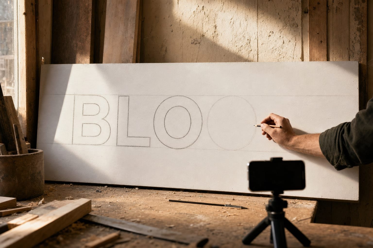
45 minutesDemonstrate ruling one pencil baseline all the way across the board with a level or long straightedge. Show how the whole word now has a floor to stand on. Everything today hangs from this one line, so it is worth taking a full minute to get it truly level before anything else goes down.
- (6 min) Students rule the baseline and cap-height line across the real board with a straightedge, matching the layout from session 1. The AR step comes next; the pencil lines are the safety net that catches drift. The Grid Maker Pro AR app is a separate paid add-on — free tier gives three own-photo traces a month, $29.99/yr, $6.99/mo, or $79 once for good; Android first, iOS planned. The overlays stay free in the browser.
- (6 min) They clamp the phone and lock the layout artwork over the board with AR, aligning the on-screen baseline to the ruled baseline. When the two baselines sit on top of each other, the letters land in their slots.
- (14 min) Students trace the logo and lettering by hand onto the board, checking every few letters that the bottoms still touch the ruled baseline. A letter that floats above or dips below the line is the first thing a viewer notices — fix it now in pencil.
- (4 min) Mid-point check: sight along the baseline from the side of the board. Any letter breaking the line jumps out at this low angle. Straighten it before outlining in paint.
- Did any letter drift off the baseline, and could you trace the drift to the ruling step or the tracing step?
- How much of a clean sign came from a steady hand versus a straight baseline and even slots?
- A sign is public and permanent. What does your lettering say about the business or idea behind it?
Take the same idea further with how to trace a photo onto paper and the baseline-grid overlay page. The AR transfer step lives in the Grid Maker Pro AR app; every overlay stays free in your browser.
Assessment rubric
4-point scale per criterion:
| Criterion | 4 — Mastery | 3 — Proficient | 2 — Developing | 1 — Beginning |
|---|---|---|---|---|
| Baseline & cap height | Baseline dead straight, cap height consistent across the word | Straight with minor height variation | Some waver in the baseline | Baseline not established |
| Letter spacing | Even slots with sound optical adjustments | Even measured spacing, few optical fixes | Noticeably uneven in places | Crowded or gapped throughout |
| Transfer accuracy | Artwork transferred cleanly on the ruled lines | Transfer accurate with small slips | Some drift off the guide lines | Transfer misaligned |
| Diagnosis & correction | Traced errors to layout, not the hand, and fixed them | Corrected most issues with prompting | Caught a few issues | Errors left uncorrected |
Extensions
- Curved baseline: Have students lay out the same word on an arched baseline for a round sign or a badge, keeping every letter perpendicular to the curve. The rule holds; only the line bends.
- Cross-disciplinary (design history): Research how hand sign-painters used chalk snap lines and pounce patterns before phones, and compare that workflow to the baseline grid and AR — same goal, different tools.
- Differentiation: Students who need support letter a short two- or three-letter word on a wide slot; advanced students set a two-line sign with a shared vertical grid and a logo mark aligned to the type.
- Typography deep-dive: Connect the baseline and cap-height lines to real type anatomy — x-height, ascenders, descenders — using the baseline-grid overlay to see how body text and display type share the same skeleton.
More lesson plans: browse all. Want this plan customized for your curriculum? Email us.